Liberty Tower
In 2017, the Chase Tower re-opened with a brand-new hotel and bar. I was honored to participate in the branding process. I poured my heart into a logo and new visual identity for the tower, aiming to add a stamp of South Bend pride onto those 25 stories of local history.
Logo
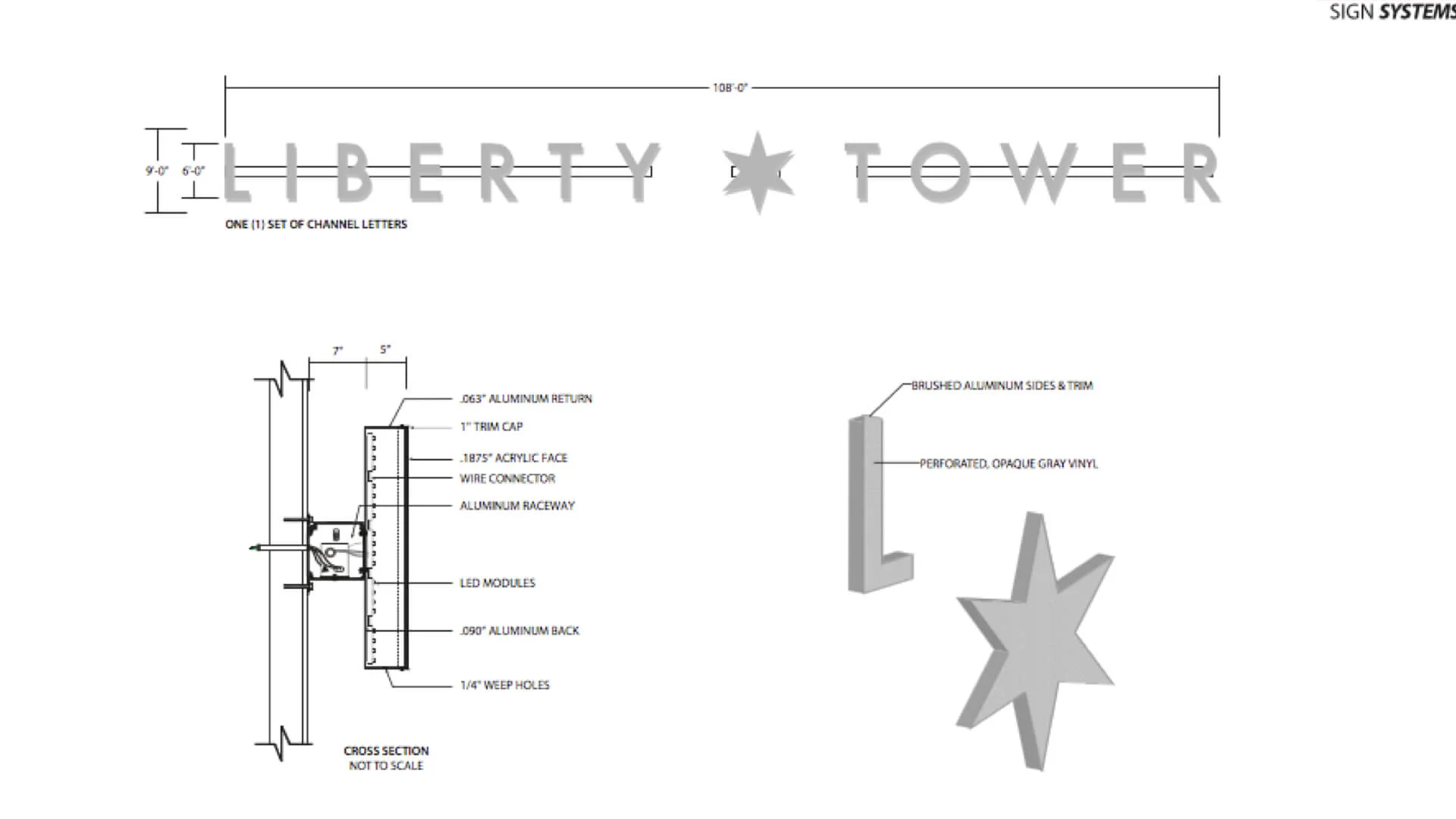
It took a month of sleepless nights to find the courage to make this logo one six-pointed star.
The 6 points represent the 6 districts of South Bend, meeting to form a unified, diverse city.
The star paired with Aloft’s soft blue creates a patriotic branding image. Perfect for broadcasting Liberty.
The star is the same emblem found on South Bend’s flag. This was my way of painting Liberty Tower’s vision for downtown: a building reclaimed for every person in South Bend.
Liberty Tower: A building as connected to our community as the star is to our flag.
SIGN INSTALLATION
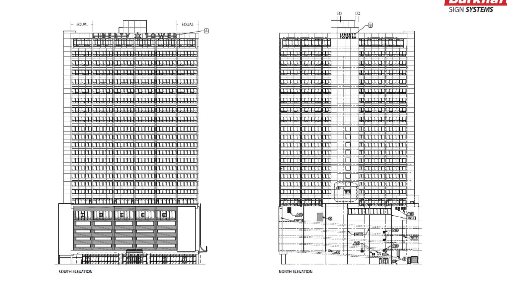
I worked with Burkhart to design and install the logo on the South Face of the building. The install effort was a massive effort involving a huge team of people. I played the small role of working with Burkhart to ensure the logo perfectly matched our creative vision for the building.
Aloft Co-branding
Sure, the logo looks cool on top of that building. But at the end of the day, it needs to work.
One of the biggest goals for the project was for the new tower brand to sit easily alongside the Aloft Brand. to achieve this, I used futura, aloft’s secondary typeface, and aloft’s secondary blue. Now, when used in digital pieces, the star sits easily next to aloft branding.


